Why Your Business Needs a Mobile-First Website in 2025
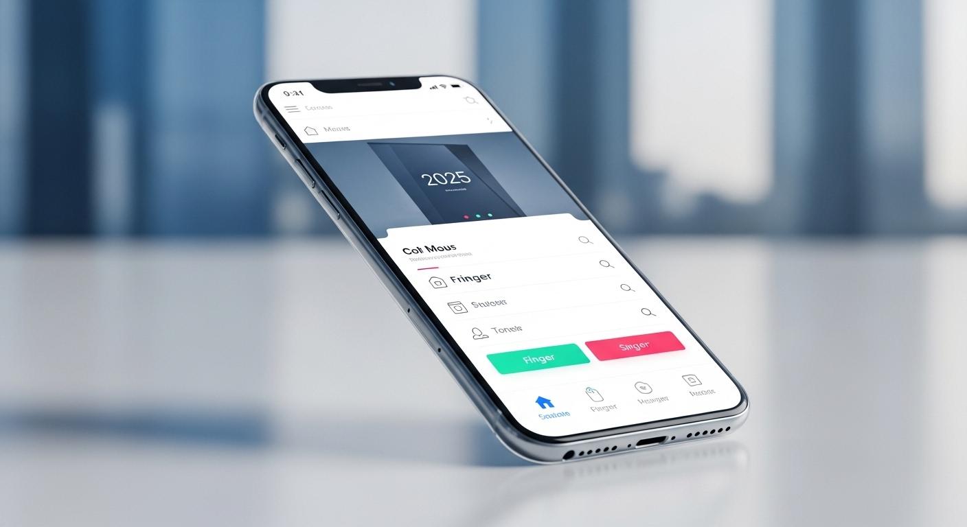
A few years ago, having a “mobile-friendly” site was a nice bonus. Today, it’s survival. More than half of all web traffic comes from mobile devices, and Google now ranks sites based on their mobile experience first, not desktop.
In 2025, a mobile-first website isn’t just about convenience—it’s about visibility, credibility, and revenue. Let’s break down why this shift matters and what it means for your business.
1. Mobile Traffic Is the New Normal
Take a look around: people aren’t sitting at desktops to browse anymore. They’re scrolling while commuting, shopping while waiting in line, or checking out your site during lunch breaks.
If your site isn’t designed for that experience, you’re losing potential customers before they even know what you offer.
👉 Reality check: if your site looks broken or slow on a phone, your brand instantly feels outdated.
2. Google’s Mobile-First Indexing
Google now crawls and ranks the mobile version of your site before the desktop one.
That means if your mobile site is clunky, incomplete, or slow—you’ll slide down the search results, no matter how good your desktop site looks.
👉 Translation: SEO is officially a mobile-first game.
3. User Experience = Trust
A smooth mobile site builds instant trust.
- Easy navigation
- Fast load times
- Clean layouts
These signal to visitors that you care about their time. On the flip side, a poor mobile experience tells them you’re behind the times—and they’ll bounce.
Remember: trust leads to conversions.
4. Designing for Thumbs, Not Cursors
Mobile-first isn’t just about shrinking things down to fit a smaller screen. It’s about rethinking the way people interact with your site.
- Big, tappable buttons instead of tiny links
- Simple, clear menus instead of cluttered dropdowns
- Text that’s readable without zooming
Frameworks like Tailwind CSS make it easy to build responsive layouts that adapt beautifully to any screen size.
5. It’s About Sales, Not Just Design
Whether you’re running an e-commerce store, a restaurant, or a service business, most customers will meet you first on their phone.
If that first impression feels frustrating, they won’t come back.
👉 A mobile-first site isn’t a design trend—it’s a sales tool.
Final Thoughts
In 2025, “mobile-friendly” isn’t enough anymore. You need mobile-first. That means putting the mobile experience at the center of your design strategy, not treating it as an afterthought.
Your future customers are already on mobile.
The question is: will your website meet them there?
✨ Call to Action
Need a website that actually works on the devices your customers use most? Let’s build a mobile-first site that keeps them engaged—and keeps you ahead of the competition.